


Accessibility and inclusion go hand in hand. The goal of universal design is to make products that are better for everyone. It’s a simple, very sensible concept, and when executed properly it’s also a beautiful user experience. Bells and whistles are not required to achieve this feat, more often, the basics of a vision friendly interface light the way. Keep it clear and simple!
On Global Accessibility Awareness Day, it feels particularly appropriate to report, according to the World Health Organization (WHO), globally 2.2 billion people have a near or distance vision impairment. The number is considerable and begs us to ask the question, why are so many web pages designed to make reading difficult? Who decided it was a good idea to cram all kinds of extra stuff onto a page which distracts us from the content we came to read and ruins the reading experience? It defies sensibility and makes you wonder, why not make it easier to see content published for the purpose of being read and appreciated. Doesn’t the writer’s work, and our attention span of the reader, deserve better treatment?
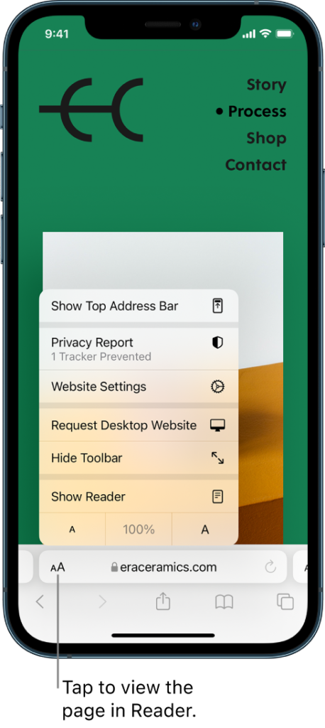
option in iOS AA menu.
Image credit: Apple
What Readers Can Do
When a busy, cluttered page is encountered, make it easier to read by turning on the Reader view in your browser, which can magically remove ads and pop-ups, leaving the text you wish to read without distraction. In Safari on iOS, tap the AA button to the left of the address field, select Show Reader. On a Mac, at the left side of the address bar click the icon that resembles lines on a page. In Microsoft Edge, Firefox, and Vivaldi, a similar icon launches Reader Mode from the right side of the address bar. It’s a bit more complicated in a Google browser. Contact Google, Apple, or Microsoft for Accessibility Support by Phone.
What Web Designers Can Do
The acronym KISS (Keep It Simple Stupid) is a design principle which states that most systems are best when kept uncomplicated. Here are a few ways to simplify for the eye.
- Highly contrasted text and backgrounds are the easiest to read. Go black on white, with an option to reverse to white on black. Pale font colors are not good and darkish backgrounds aren’t good either.
- Don’t put text on top of darker toned Don’t use decorative, script or serif fonts, clean sans serif font styles are easier to read.
- Moving text is hard to read and moving images are hard to see, so keep it still and your content won’t disappear in front of our eyes.
- Text size matters, be generous with the points and the weight.
- Clean layouts are appreciated by all, cluttered, chaotic pages are not. Keep it as linear as possible with no more than two columns.
- No pop-ups.
- Don’t place ads or create distractions in the middle of an article.
- Don’t interrupt an article in progress to promote other articles.
Understand inclusion. Don’t assume visually impaired people are not on your website — we are everywhere.


